I make things easier for people, whether it's a first-time insurance buyer, a wealth investor, or someone just trying to pay a bill. A Senior UX Designer with 8 years across insurance, wealth management, retail banking, enterprise telco, and design systems in Southeast Asia.
"Your challenge is to envision how a core banking app could meaningfully support the family or household ecosystem in managing their shared and individual financial responsibilities."
Duration1 week
Artifacts1 user journey prototype 1 presentation
Scope
"Reimagining digital banking experience this time, focusing on multi-generational needs and shared family or household finances"
Multi-generationalThe full multi-generational spectrum covers multiple roles
Household financesThis covers shared and individual financial responsibilities.
The brief spans an entire family ecosystem, too broad to serve well in one week.
My action plan is to scope deliberately, map each role, then commit to the one with high value.
How many users are within the multigenerational ecosystem?
Child & Teen (<18yrs)
The young dependent. Under 18.
Job
Build first money habits, parent manages on their behalf.
Junior Savings Account
Child & Teen
Young Adult (>18yrs)
Between uni age and early work.
Job
Move to full independence.
Own Basic Savings / Current
Young Adult
SelectedCaretaker Adult
Primary user and account holder, caring in both directions.
Job
Manages upward, downward, and sharing of household finance.
Digital Wallet Account
Caretaker Adult
Spouse / Partner
Shares household finances alongside the hub.
Job
Shared/pooled everyday spending.
Shared pot
Spouse / Partner
Sibling / Co-caregiver
Shares responsibility for Older Dependent.
Job
Coordinate care/support.
Edge case
Sibling / Co-caregiver
Older Dependent (>60yrs)
Owns their own money, receives care from children.
Job
Access finance facilities and complete jobs to be done.
Basic Savings, Senior Savings
Older Dependent
Research
Design is the search for a good fit between a form, and it's context.
What makes a problem what it is: human needs, technical constraints, conflicting requirements, habits, edge cases, and relationships. Bad design appears where those forces remain unresolved. Good design appears where those misfits have been worked through carefully. Christopher Alexander, Notes on the Synthesis of Form (1964), via Karri Saarinen, 2026
In here, my aim is to first shape the problem. Before I can work on the form, I must know the fit.
A behavior
How does the user interact with digital tools to manage their finances?
A theory or hypothesis
How do people pool or separate money with their children / parent? Do they avoid a shared pot if they do?
User Preference
Do users have a preferred method of money distribution?
Research Method
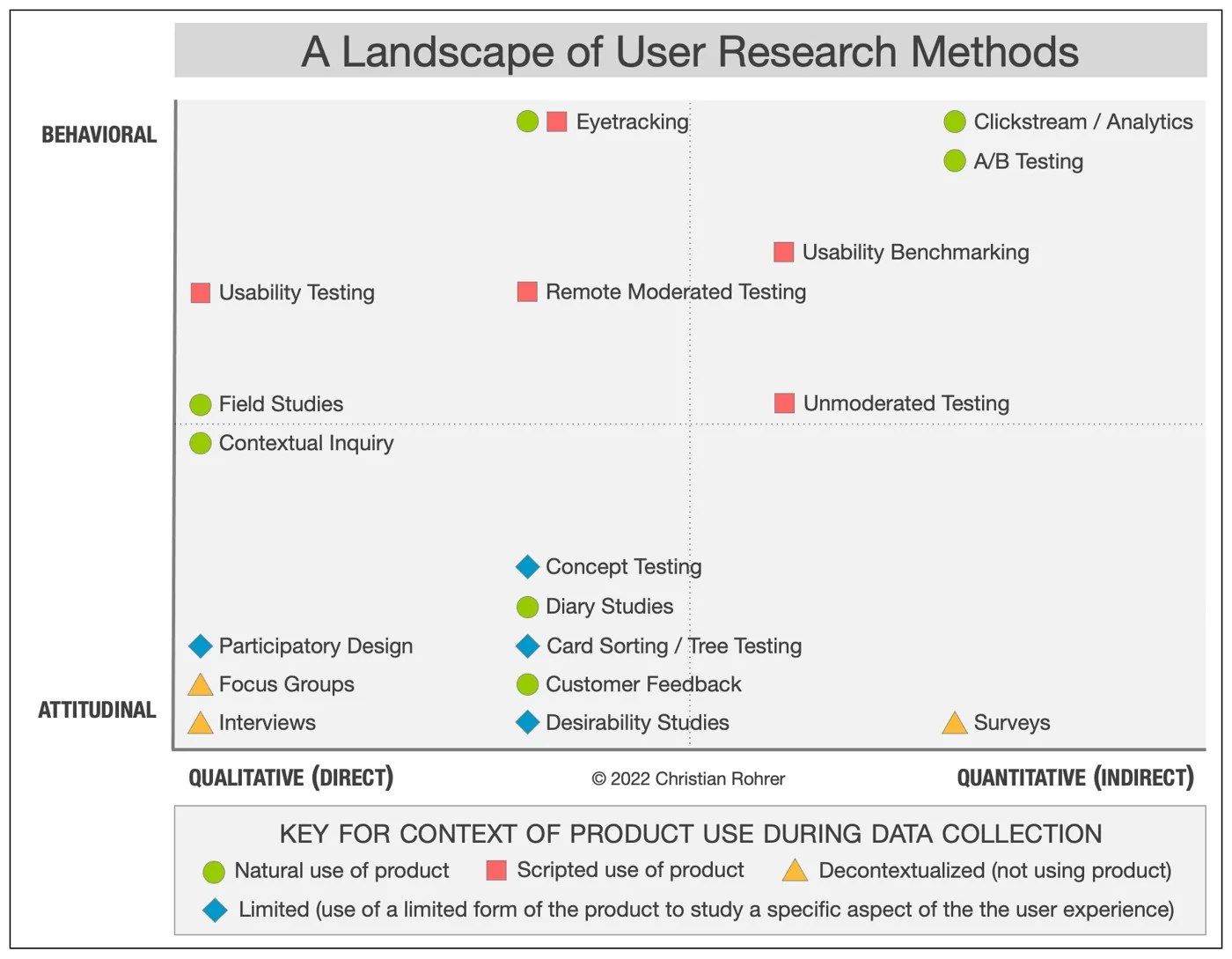
Within UX research, there are various methods to collect data. Below is a map of various methods.
The diagram below categorises the methods into how the product is being used when testing. Because the users will not be using the product during the study, we will focus on Decontextualised methods of focus groups, interviews, and surveys.
Keeping in mind the limited time box, I focused on recruiting users who pass as the Caretaker Adult, and spoke with two of them. The methodology was Interview, Qualitative (Direct), with questions focused on the “Why” and “How to fix”.
Interview Questions
Title: How money moves in your family?
We're conducting an interview to understand how you invest and interact with financial platforms. Your feedback will help us design a more intuitive financial experience.
Recruit the candidates who support children and aging elderly. Are we speaking to the right user?
QuestionsAnswersRationale, Purpose
a) Do you currently provide financial support to any children or younger dependents?Yes, regularly Yes, occasionally No
b) If yes, How do you support your children? Select one or moreGive cash regularly Transfer money to them Pay their bills directly Cover medical or care costs Buy groceries and essentials Help manage their accounts or bankingFinancial support can mean differently for children of different ages
c) Do you currently provide financial support to an Older Dependent or older relative?Yes, regularly Yes, occasionally No
d) How do you support your parent / older relative? Select one or moreGive cash regularly Transfer money to them Pay their bills directly Cover medical or care costs Buy groceries and essentials Help manage their accounts or bankingFinancial support can mean differently for Older Dependent or aging relative, or in-laws
What is the current state of user habits? Understand their current preference. How do they currently use their banking apps? How does other financial channels play a role in managing one's finances.
QuestionsAnswersRationale, Purpose
1. How do you budget your finance for your children?I budget a base amount monthly, with minor variables I budget a base amount monthly, with high variables I don't have a set budget, as the amount varies monthlyDepending on the type financial support, and/or family situation (i.e. age), the amount can be consistent or varies each time
2. What is your preferred method to support your children? Select one or moreTransfer money to individual account Joint account or cash pooling e-Wallet Debit or prepaid card Credit card Pay their bills directly None of the aboveHow much agency do parents provide to their children? What are the factors of the current method? Choice by default or certain preferences, motivations?
3. Why are they your go-to choice? Scale: 1 = Not important, 5 = Very importantEase of use · Trust & reliability · Parental Control · Security · Fraud and Scam Prevention · Mobile app design · Speed & convenience · Usable everywhere · Cross-Border Payments · Financial Features · Mobility and Tolls · Shared pool money · Separate funds for purpose · Weekly or monthly auto-deductionsHow much agency do parents provide to their children? What are the factors of the current method? Omnichannel touchpoints
4. How do you budget your finance for your Older Dependent?I budget a base amount monthly, with minor variables I budget a base amount monthly, with high variables I don't set a budget, as the amount varies monthlyDepending on the type financial support, and/or family situation (i.e. age), the amount can be consistent or varies each time
5. What is your preferred method to support your Older Dependent/relative? Select one or moreTransfer money to individual account Joint account E-Wallet or cash pooling Debit or prepaid card Credit card Pay their bills directly None of the aboveHow much agency do parents provide to their children. What are the factors of the current method? Omnichannel touchpoints
6. Why are they your go-to choice? Scale: 1 = Not important, 5 = Very importantEase of use · Trust & reliability · Parental Control · Security · Fraud and Scam Prevention · Mobile app design · Speed & convenience · Usable everywhere · Cross-Border Payments · Financial Features · Mobility and Tolls · Shared pool money · Separate funds for purpose · Weekly or monthly auto-deductionsChoice by default or certain preferences, motivations? What matters most? Market & Feature Benchmark
What is the current state of user habits? Understand their current preference. How do they currently use their banking apps? How do other financial channels play a role in managing one's finances.
QuestionsAnswersRationale, Purpose
7. What challenges do you face when managing your family finances? Scale: 1 = Not important, 5 = Very importantBudgeting and Tracking · Debt Management · Emergency Fund Planning · Education Planning · Retirement Planning · Rising Cost of Living & Inflation · Poor Communication · Different Financial Goals
8. How many institutions are you currently trying to manage?Enter value
9. If we could ease your financial management, what are some ways the banking app could assist?Debt Pay down Progress · Unified Categorization · Salary Splitter · Virtual Wallets · Low-Balance Predictions · Smart Bill Calendar · Auto-Sweep Rules · Different Financial Goals · Other: ______How to reduce the load of users managing multiple financial assets. Do they need automated budgeting feature? Do they require investment aggregation features
Where does the user currently stand in their wealth situation?
QuestionsAnswersRationale, Purpose
10. Which of the following best describes your current financial stage?
Stage 1: My income barely covers my day to day essentials, and I am focused on cutting costs.
Stage 2: I can comfortably pay my basic bills and repay my debts, but I have little left to save.
Stage 3: I have consistent control over my finances, a growing emergency fund, and I routinely save/invest.
Stage 4: My investments are growing steadily, and I am actively tracking my progress toward clear long term goals.
Stage 5: I no longer rely solely on my employment income to cover my daily living expenses.
Stage 6: I have surplus wealth that allows me to live generously, fund large goals, or pursue passions freely.
Stage 7: I am focused on long term estate planning, building trusts, and passing wealth to the next generation.
Prefer not to say
Removes Income sensitivity. Do they need automated budgeting feature?
Insight
Method: Remote interview (audio)
Sample size: 2
Duration: 20-25 mins
A note on sample size
I opened the session for 3 days. Finding the right people, Malaysians who support family financially was hard, and money is a sensitive thing to ask my peers and strangers about. So I landed with depth over numbers: two of in-depth interview, treated as early, directional findings.
User Persona
HK
"Must not cause me to take additional steps from my current behavior, is there incentive for me to do that?"
Henry K (Mid 50s)
Behavior
Scheduled for baseline amount and ad-hoc for variables
Provides allowance to children on weekly basis
Manages expenses mainly through bank accounts, joint account with his spouse, and e-wallet for children
Won't change behaviour without a clear reason or incentive
Profile
Full time employee in private sector, steady salary income
2 children studying in university dependent for academic support and a portion of living cost
1 Older Dependent fixed amount support with occasional ad-hoc transfer
Shares financial responsibility with his spouse
Preference
"Keeping it secure doesn't necessarily translate to speed and automation, I value security above anything else"
He manages across a few channels and is fine with it, aims to not add on more fragmentation/new channels
Pain Points
Mild pain point, does not see major issues with services offered by banks and other financial services
Does not seek new features, only enhancements towards convenience, speed, and security
SJ
"Even though we give them the indication, they will not be able to remember"
Shibu J (Early 40s)
Behavior
Supports children on a needs basis, provides daily budget, supervised credit card, not a fixed allowance
Supports parents on fixed amount transferred, foreign currency exchange
Manages more than 10 facilities
Profile
Full time employee in private sector, expat working abroad
2 young children in their primary school
Parents are Older Dependent fixed amount support with occasional ad-hoc transfer
Sole provider to his family
Preference
Uses e-wallets deliberately as a buffer, reduce digital footprints on low-risk facilities
Selects institutions on practical criteria, speed of transfer, convenience, exchange rate ranks 3rd
Sees himself as the steward of his growing wealth
Pain Points
Children accessed saved card details and made accidental in app purchases
Elderly parents struggle with digital banking, remembering password, prolonged login inactivity, surprise minimum-balance charges
Executive Summary
Elderly parents' digital banking struggles
From forgetting minimum balances to password confusion - digital tools fail elderly parents, creating ongoing friction in family financial support.
Security drives channel selection
Participants actively choose channels that limit exposure - eWallets as buffers, avoiding cash for elderly parents.
Multi-channel financial fragmentation
Participants manage numerous institutions simultaneously. Fragmentation is accepted as necessary - not a problem to solve.
High inertia without clear incentives
"It must not cause me additional steps." They won't switch without clear monetary incentives or convenience gains.
Dual transfer: scheduled + ad-hoc
Regular scheduled transfers combined with ad-hoc payments - a universal mental model for family money flows.
Gradual financial independence
Participants deliberately structure support to build independence - transitioning from joint to individual accounts over time.
Ideation
Feature Ideation
Theme 1: Security
How might we protect aging adults and their families from elder fraud, scams, and money mistakes?
Security Hub
Up-to-date articles and features related to security
Is this a scam? AI Checker
Screenshot a SMS or paste a message/number - check if it's risky
Safety Net
Trusted Contact Person as proxy to help elderly, or be reachable
Security Score
Self-checking awareness - help promote existing features
Theme 2: Convenience, Speed
How might we ease daily financial tasks for the Caretaker Adult?
Automate Repeat Transactions
Save as favourite on the success page
Budget Tracker
Show balance in a meter - estimate how much remains
Payment Reminders
Remind users to make monthly payments
Landscape Analysis
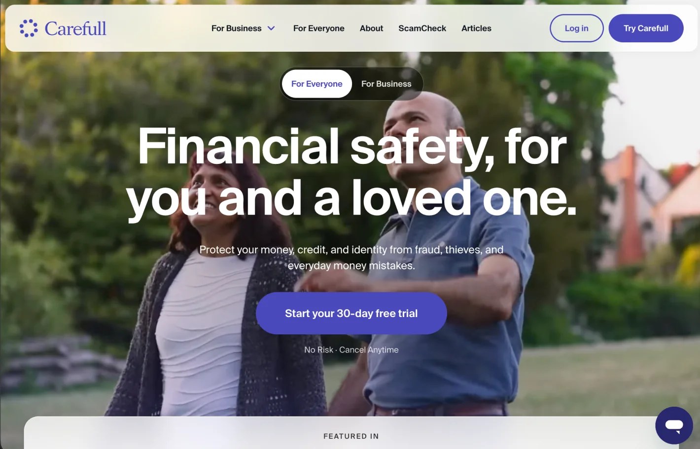
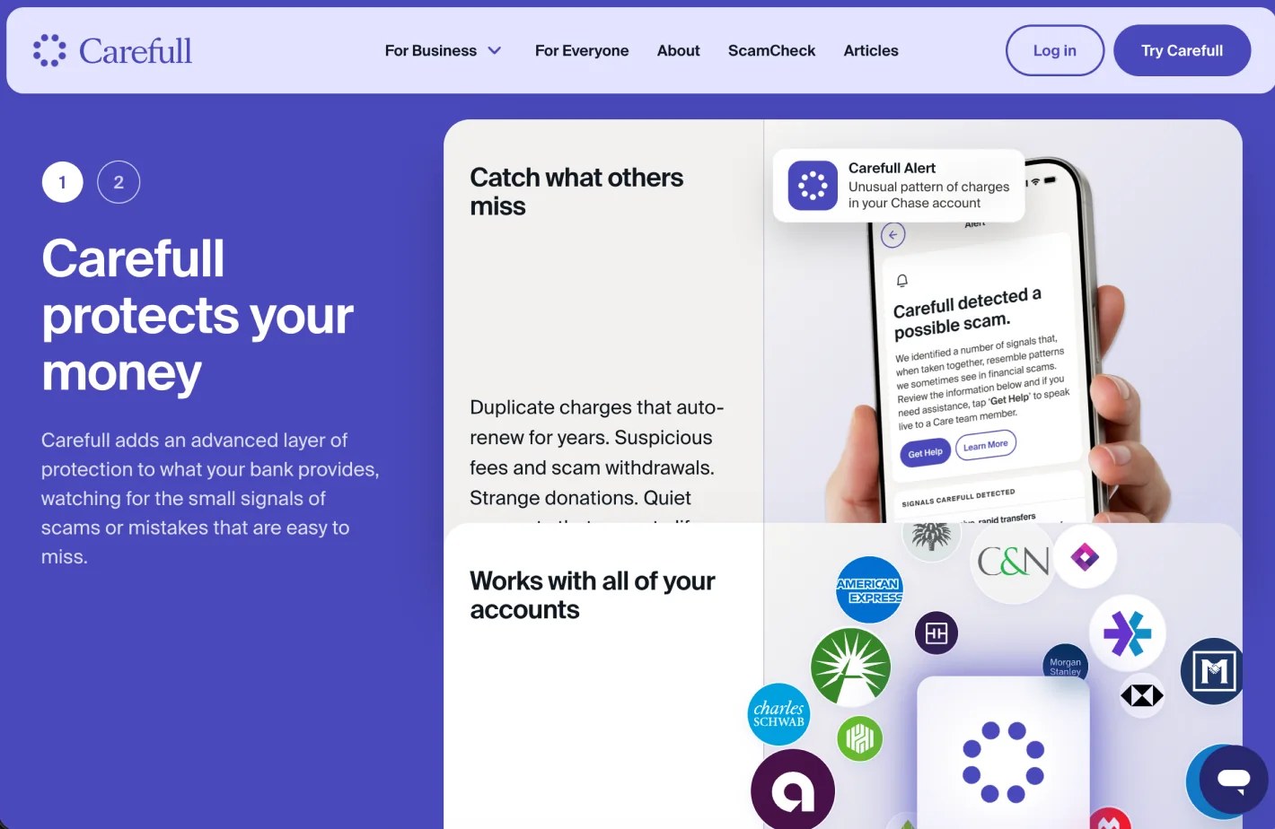
3rd party layer as security protection with a focus towards the elderly.
3rd party layer as security protection with a focus towards the elderly.
Google's "Circle to Search" can now instantly tell you if a text message is a scam.
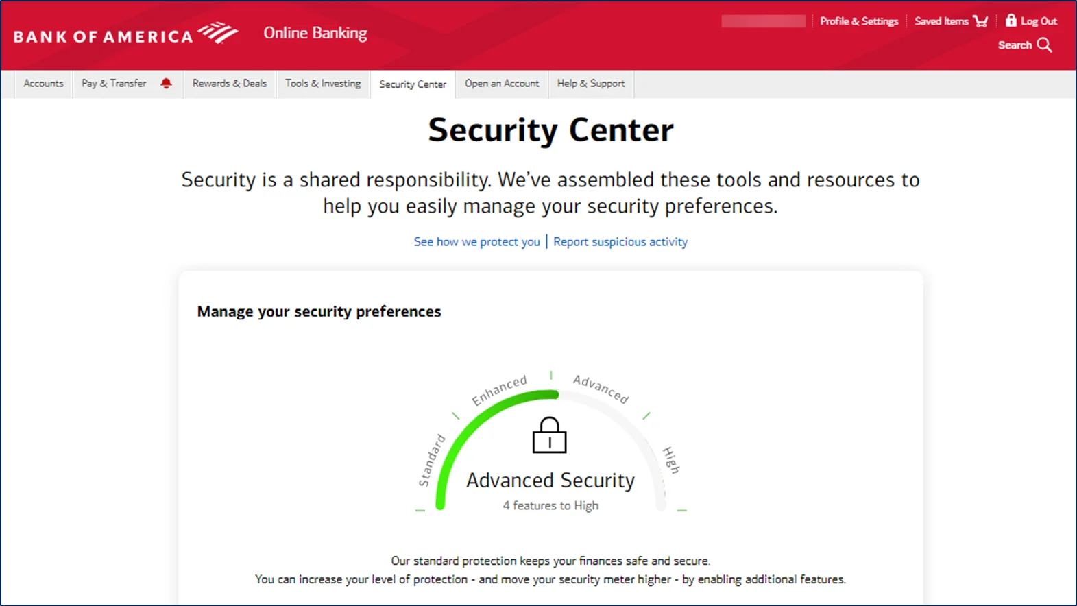
Bank of America Security Meter in our Mobile Banking app.
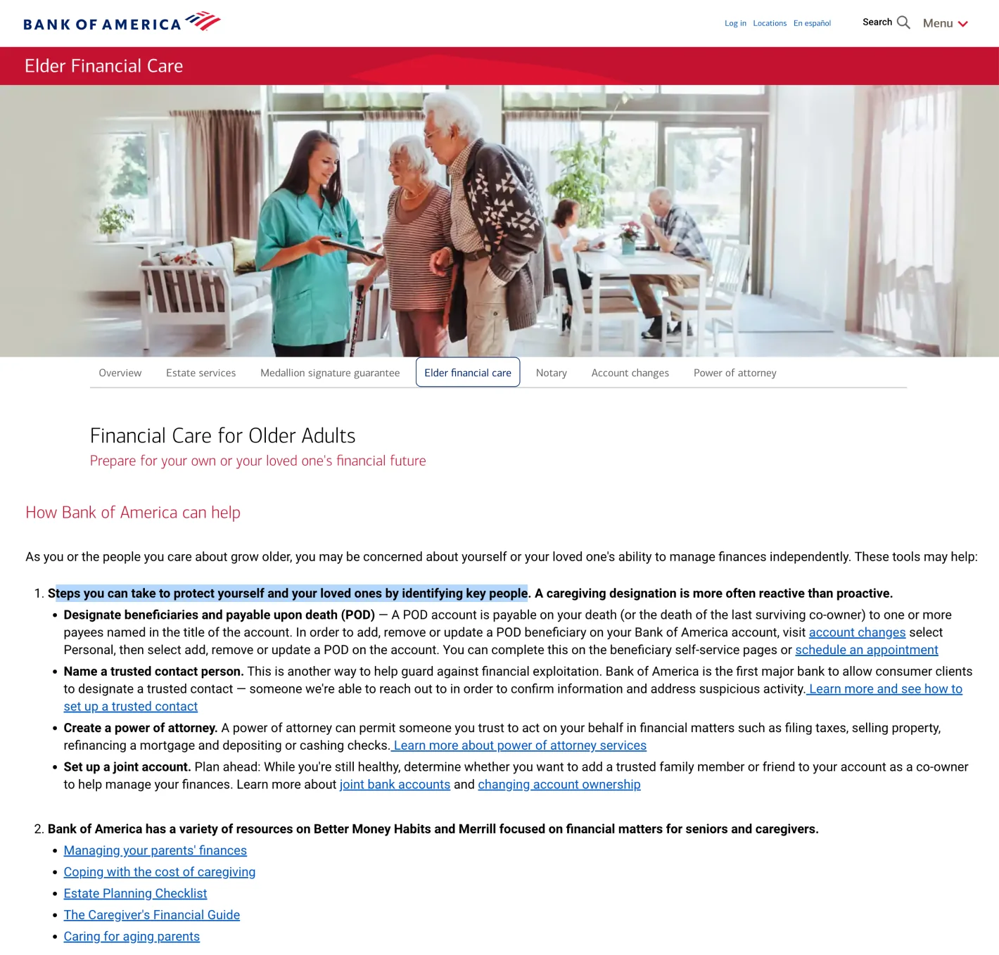
Elderly user needs: Service for Elderly, Legacy planning, Joint account planning, Trusted Contact
Solution
Selected Solution
Trusted Contact Person (Safety Net)
As a proxy to help elderly, guard activities, or be reachable. A caretaker adult nominates a trusted contact to receive alerts about suspicious transactions on an elderly parent's account - oversight without removing autonomy.
Why I selected this solution
·I chose the elderly segment, where the unmet gap is widest.
·The bank has invested well in the young and digitally savvy. Youth savings accounts, allowance tools, shared savings pots, bill splitting, expense tracking. The day-to-day money management space is well served.
·Malaysian banks do offer security features. Fund locking, account kill switches, transfer limits, ATM cash-out controls. These are useful, but they all assume one thing: that the account holder can act on their own. For an elderly user who forgets a password, misses a minimum balance, or gets talked into a transfer, self-protection is not enough.
·None of these features involve a second, consented person. That is the gap.
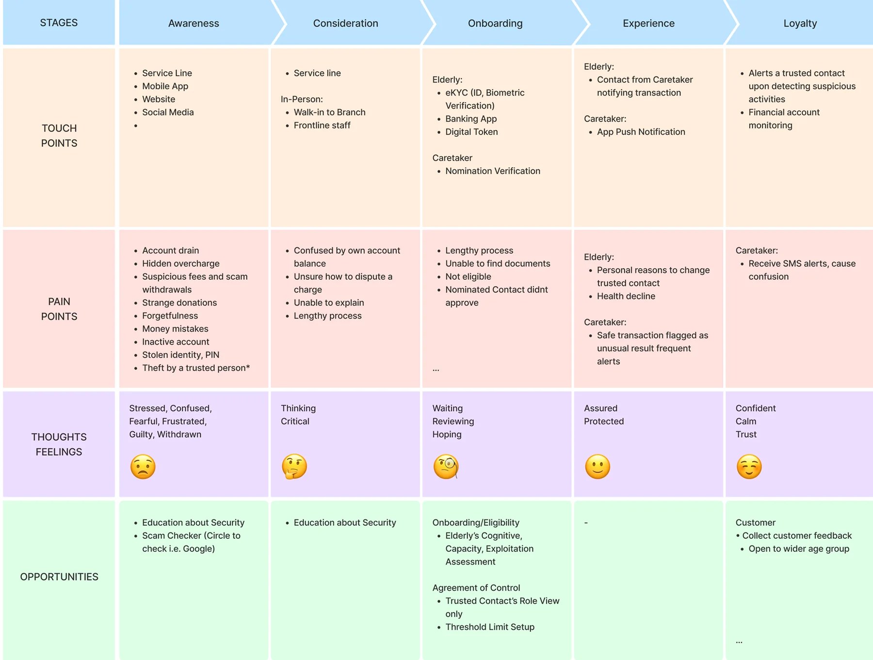
Customer Journey
Prototype
Four user stories define the SafetyNet prototype - covering both the Older Dependent and Caretaker Adult perspectives across new and registered user states.
Streamlining login and registration steps to improve completion rate
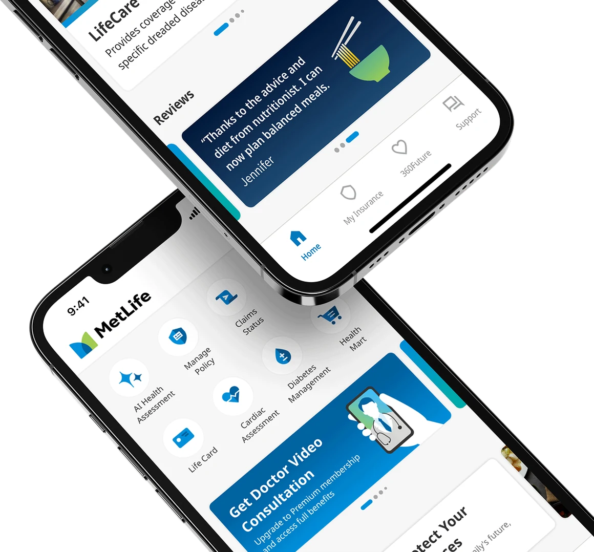
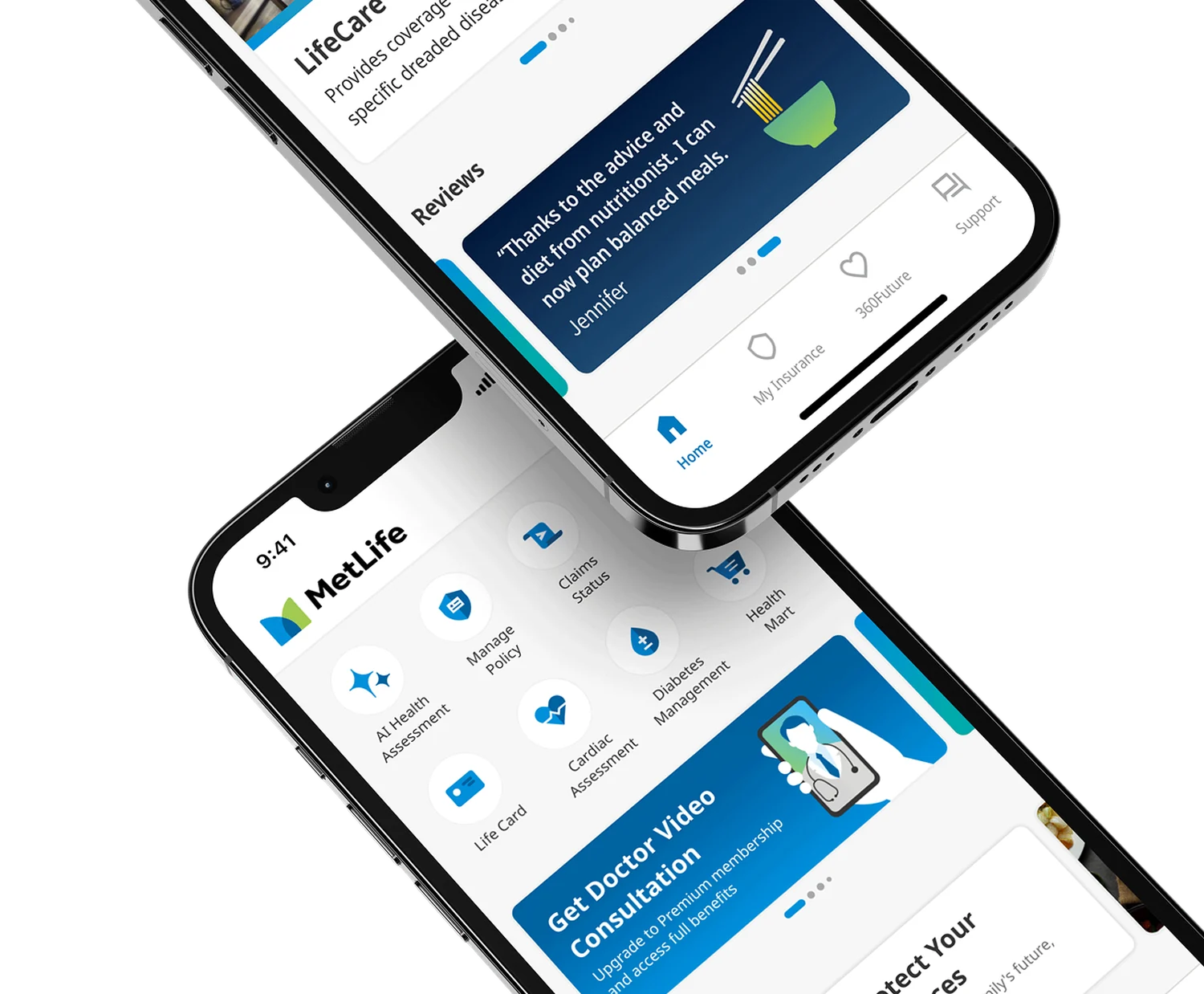
MetLife Bangladesh is an insurance app used to manage policies, make payments, and access health services like doctor consultations. In 2024, the app went through a significant platform upgrade that required every existing user to log in again under a new security standard.
The new security policy shortened session timeout from 365 days to 8 hours during an active session, and 15 minutes when idle. Logging in went from something users did once a year to something they did several times a week. All 376,000 existing users had to be told what their new credentials were.
Existing policyholders were completing registration at 20%. The people with the most reason to get in were the ones failing.
Analysis
Most users didn’t remember their credentials. Users were asked for a username, a policy number and a password. Across all three account types, most had never memorised them, because the app kept them logged in for a year.
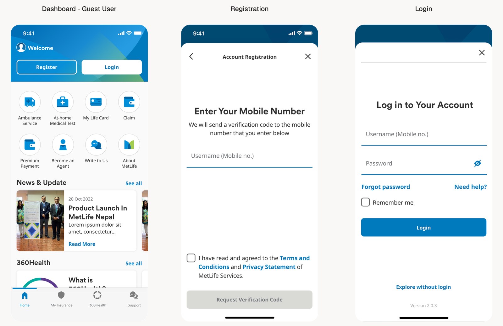
The app opened onto a guest dashboard. Registration and login appeared as a drawer sheet you could dismiss, which told people an account was optional. The previous interface prioritised feature discovery over getting users registered.
One line of copy was turning people away. The field labelled “Username (Mobile No.)” suggested that a policy tied to a mobile number was required to register. It was not.
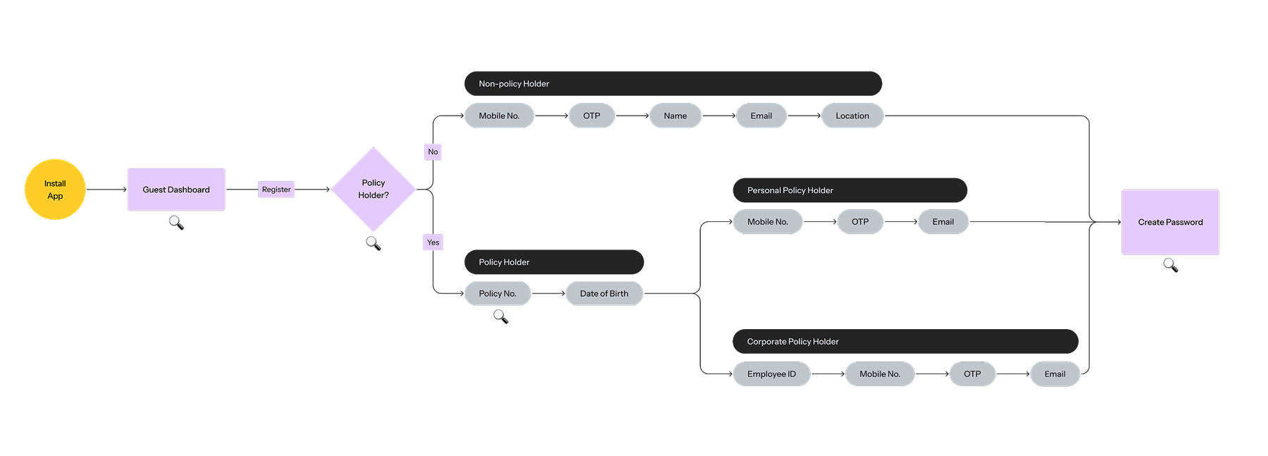
The flow gave unclear progress steps. It did not indicate which step actually created the account, and the sequence was not optimised. Fields like location added length without being needed to create an account at all.
Existing user flow
The goal was to design a registration and login experience that felt straightforward for three different types of users, while making sure as few people as possible got lost along the way.
Process
Shaping the process
1
A more direct path to account creation
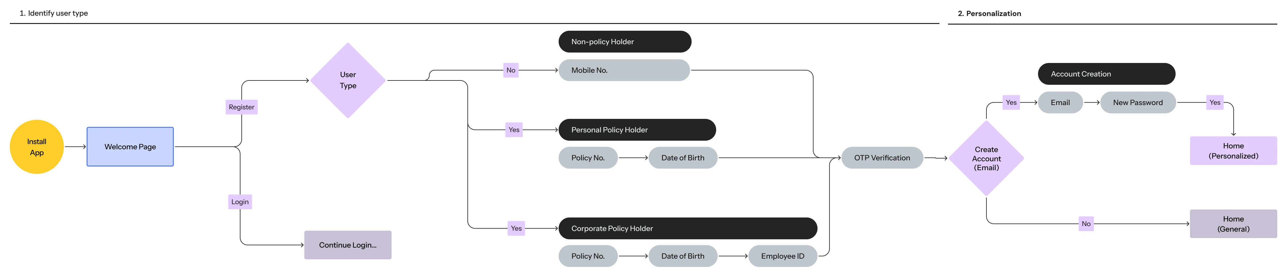
Retired the guest homepage, asking the user directly whether they are a new or existing user.
Added a step asking what type of policy they own, to split users at the first step of registration.
Moved the OTP verification prompt to after the user has submitted their details — only when necessary, rather than as the first step.
Rephrased password creation as account creation. It clarifies that creating an account from this step onwards saves the user’s data, enabling personalisation and a better app experience.
Registered users are shown a personalised homepage, tiered by membership (Basic, Standard, Premium).
Users who skipped account creation are directed to a guest dashboard, which offers the journeys that are not tied to personalisation.
The new flow asks who you are first, then shows only the steps that apply to you.
2
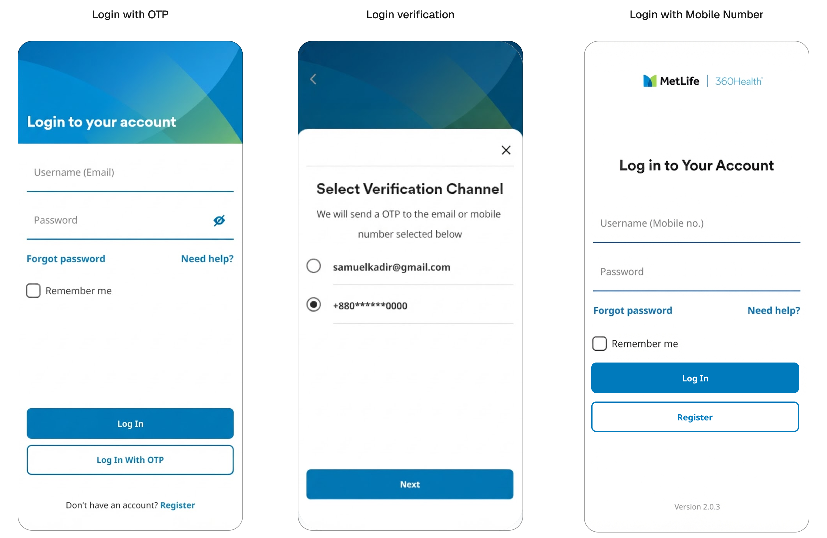
Choosing a login method
OTP login was considered as an option to simplify the experience, but could not be applied universally — some individual policyholders had multiple registered numbers or mismatched records.
Allowing users to choose their verification channel was explored, but set aside. The majority of users only had a mobile number on record, making the selection step unnecessary for most.
We looked at using mobile number as the main way to log in, but the existing data could not tell us which type of user someone was from their number alone.
We went with policy number and email as a login method, as they are the credentials that would match correctly with the user.
Several explorations on login method
3
Identifying the account type
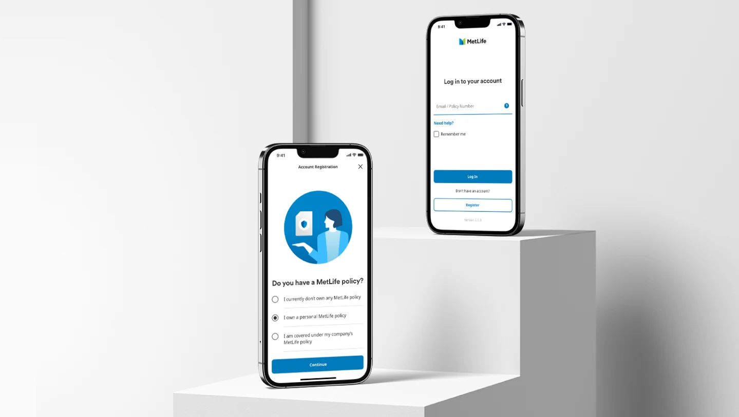
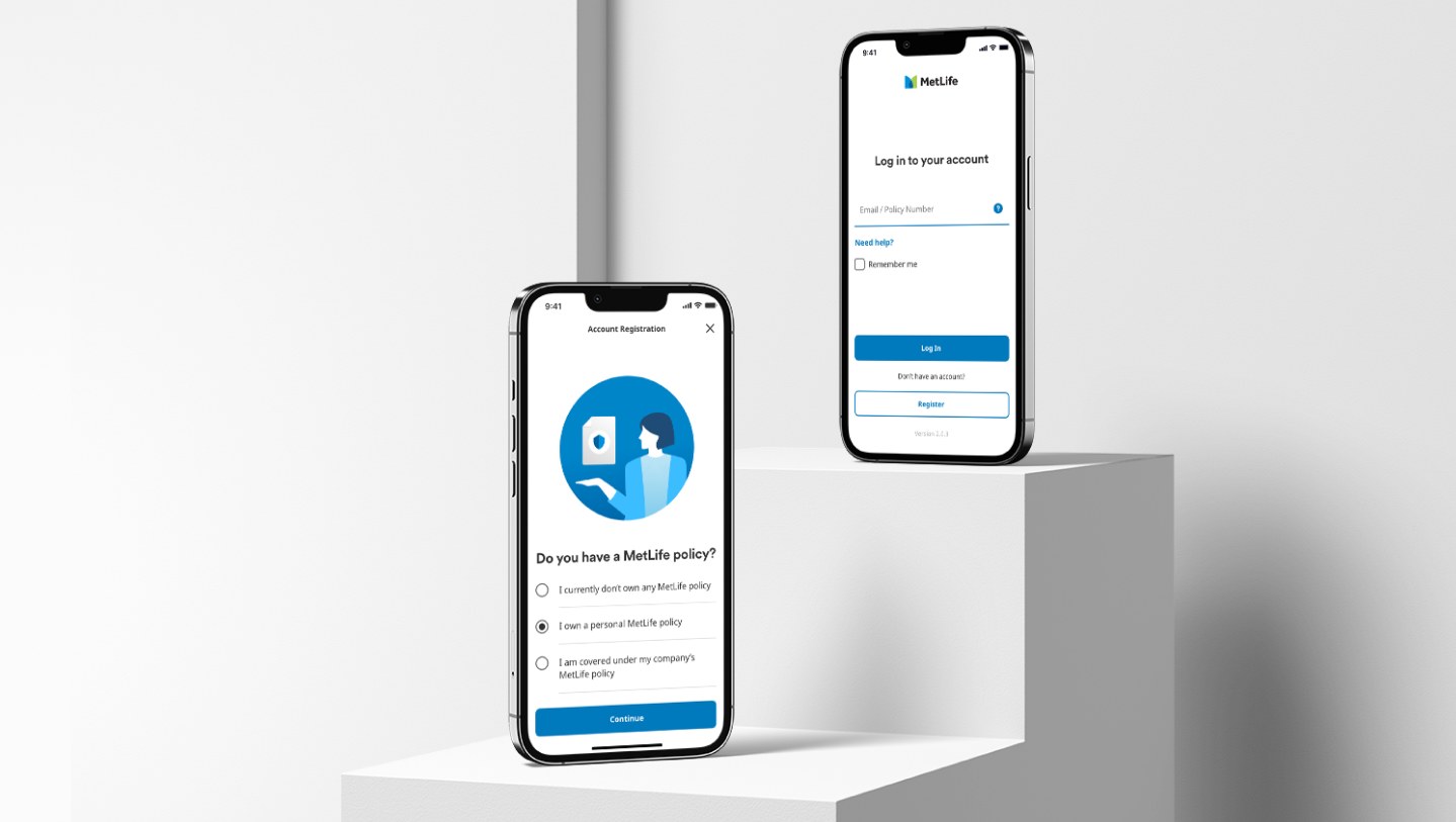
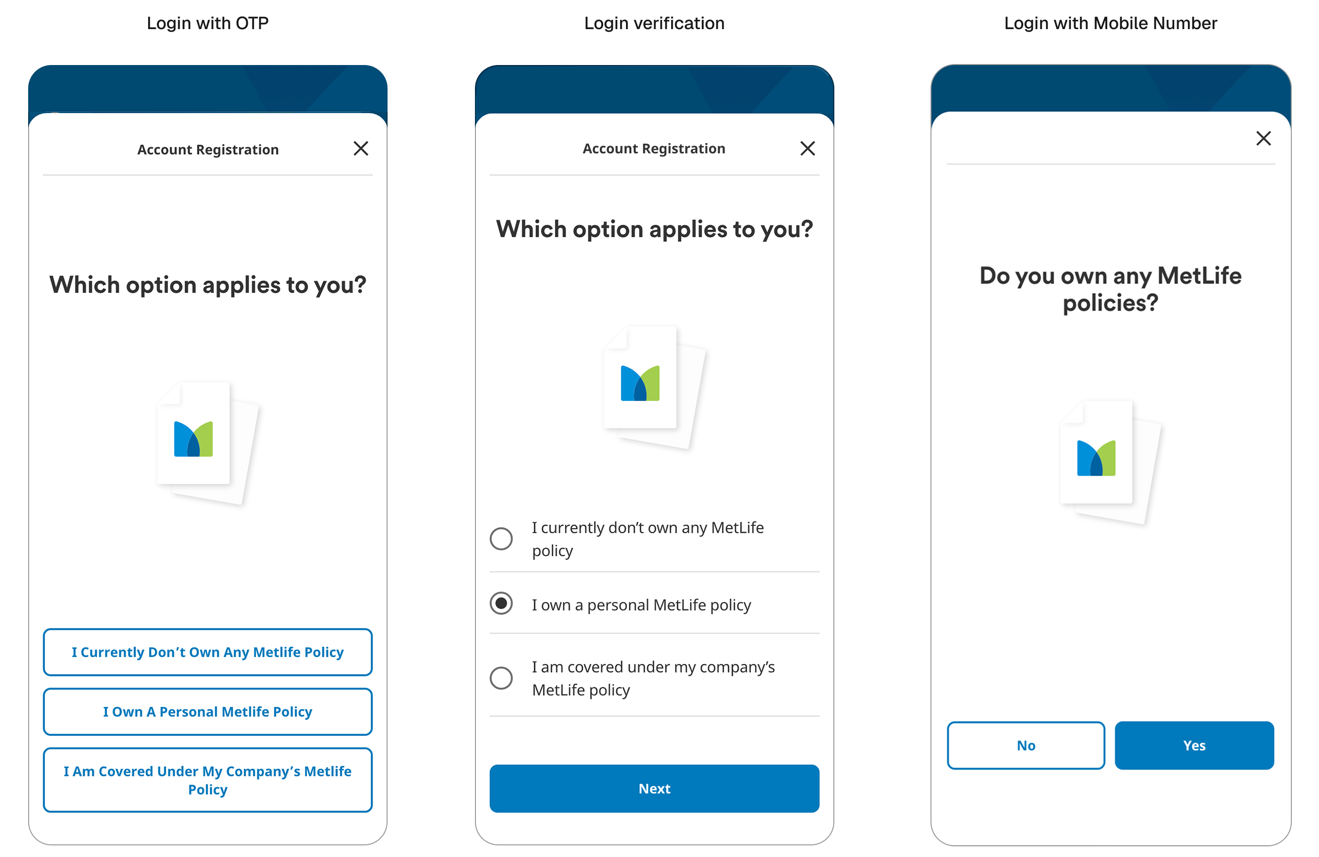
One of the first steps in registration required users to identify which type of account they were creating. Working with the UX writer, we explored different ways to present the options. Displaying answers as full-width buttons felt wordy and harder to scan. Simplifying to a yes or no question was cleaner but introduced an extra step in the flow. A radio list with a pre-selected default was the clearest approach, making it easy to read and quick to confirm before moving on.
Design options of the Account Registration page
4
Credentials people already hold
Individual, next loginPolicy no. + DOB + OTP→Email + password
Corporate, next loginPolicy no. + DOB + employee ID + OTP→Email + password
Repeat loginsOTP every time→No OTP for 6 months on the same device, biometrics offered
5
User journeys
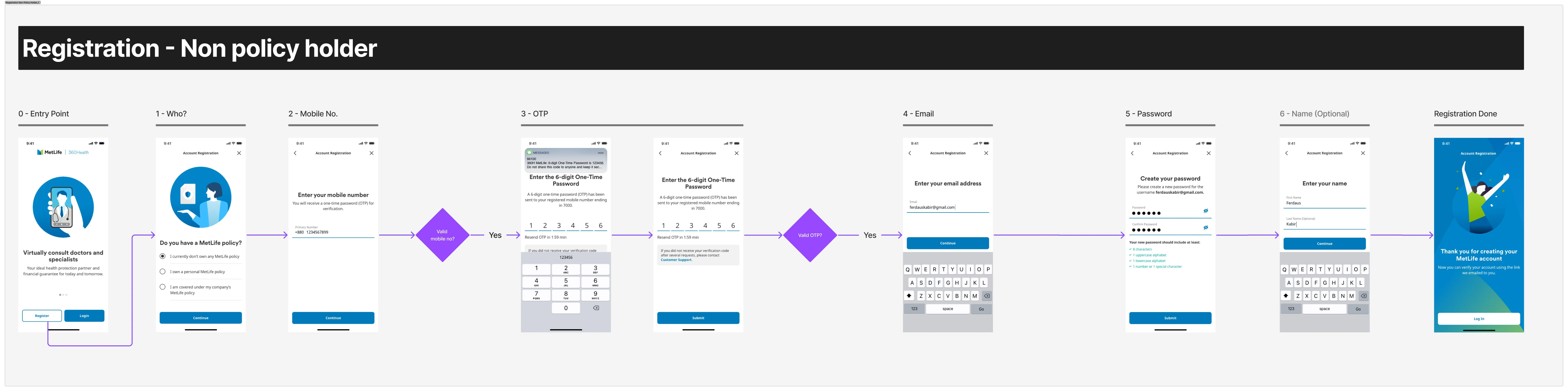
Registration journey, non-policyholder
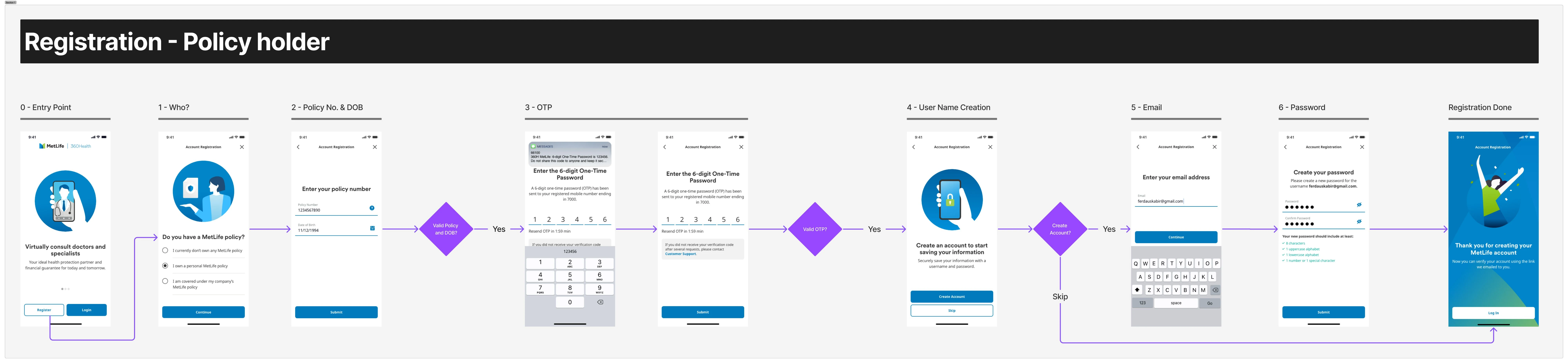
Registration journey, policyholder
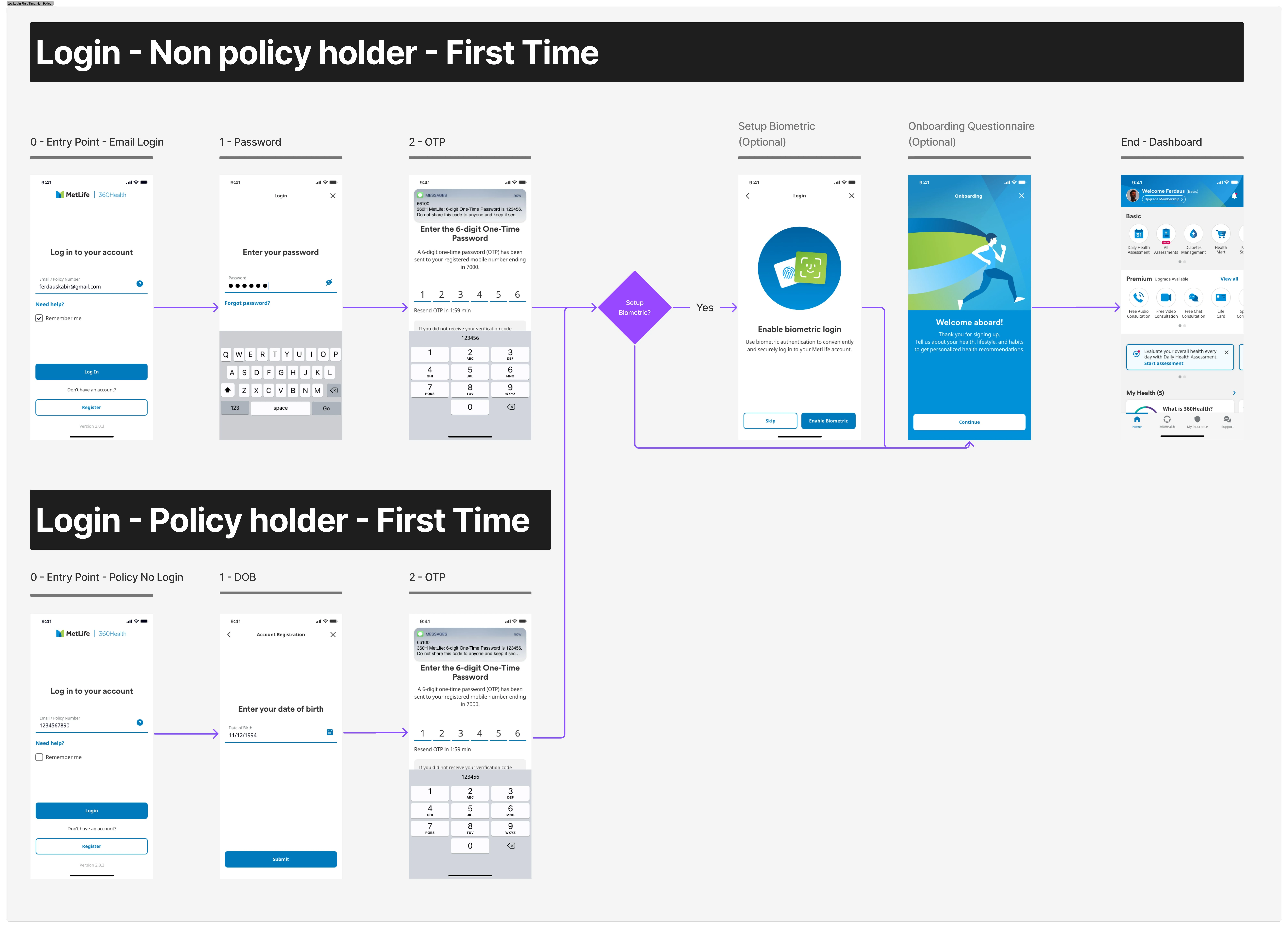
Login first time journey
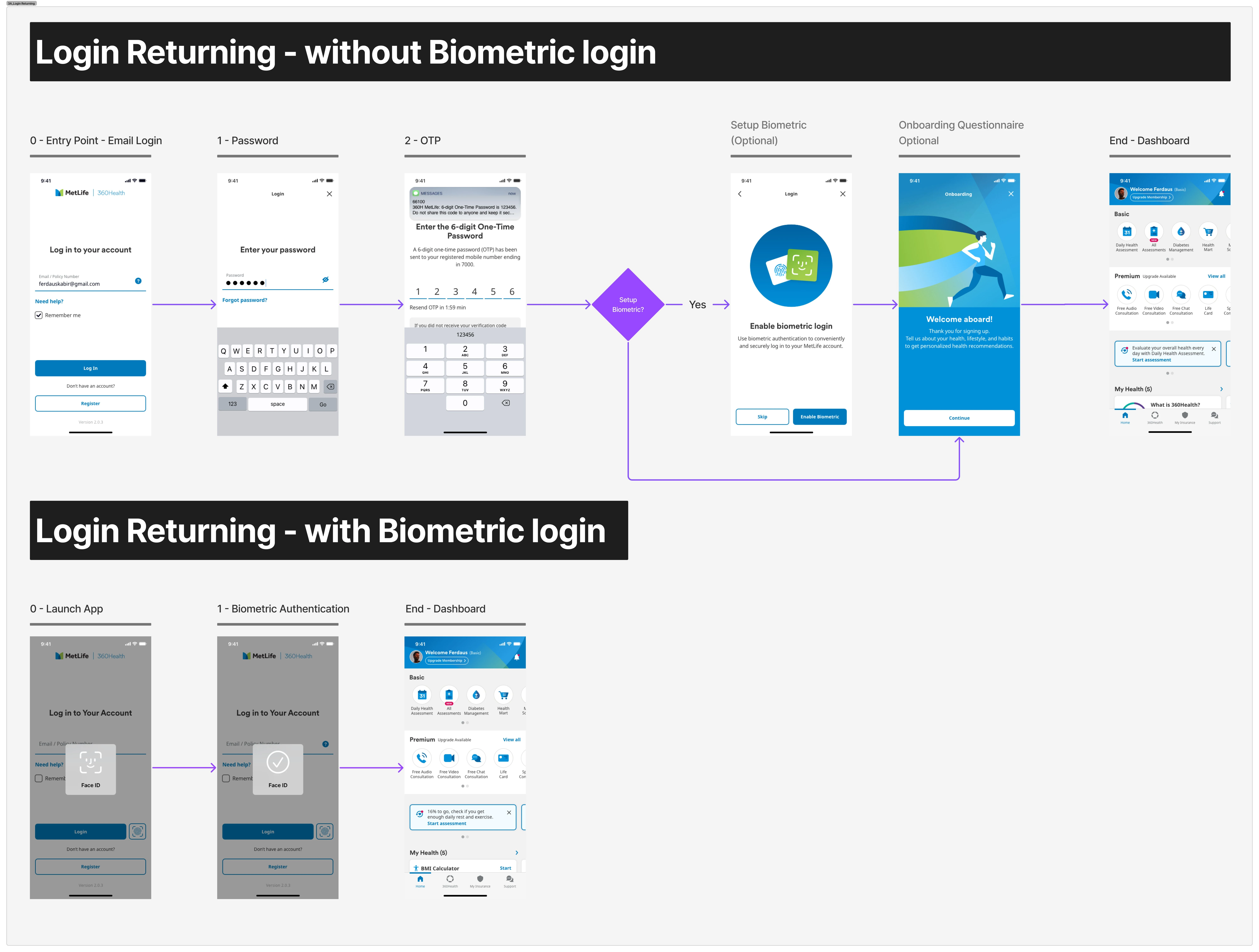
Login subsequent journey
Findings
The redesigned experience showed measurable improvement across all three user types. Non-customer registration steps were reduced from 10 to 6, with account creation placed as an optional step after key credentials were collected rather than a decision point upfront.
Completion Rate Metrics
Non-customer registration, full →35% to 42%
Customer registration →20% to 63%
First-time login, individual →44% to 50%
Task Duration Rate Metrics
Customer registration →2:23 to 2:27 mins
Non-customer registration →1:59 to 2:15 mins
First-time login →1:32 to 1:30 mins
Results against target
Scroll the table sideways to see the results →
Registration and login journeys, monthly traffic, target, and results before and after the 16 August 2024 fix
Monthly traffictotal visits
Target
Aug 24before 16 Aug fix
Aug 24after 16 Aug fix
Registration
Non-Customer
Full (6 steps)
3.8K
>70% completion rate
35%
42%
<3 mins
1:59
2:15
Skip (5 steps)
>70% completion rate
77%
84%
<1.5 mins
0:30
0:52
Customer
5 steps
3.5K
>70% completion rate
20%
63%
<3 mins
2:23
2:27
Corporate
Full (6 steps)
0.9K
>70% completion rate
28%
24%
<3 mins
1:58
2:07
Skip (3 steps)
>70% completion rate
45%
49%
<1.5 mins
0:29
0:44
Login — first timewithout biometric login
Individualfirst visit
4 steps
3.9K
>80% completion rate
44%
50%
<1 min
1:32
1:30
Corporate
4 steps
3.9K
>80% completion rate
43%
50%
<1 min
1:31
1:26
Login — subsequentwithout biometric login
Individualreturn visit
2 steps
8.7K
>90% completion rate
72%
80%
<1 min
1:16
1:07
Corporate
2 steps
8.5K
>90% completion rate
55%
74%
<1 min
1:32
1:30
Green met the target, pink fell short. Customer registration is highlighted separately — it more than tripled but still landed under the 70% bar.
Research findings
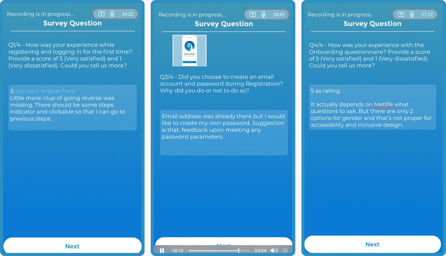
We ran an unmoderated usability test with UX Army, with 20 participants.
Time on task was 3 minutes and satisfaction averaged 4 out of 5. Most people said the questions were relevant and the flow was easy to get through.
The key stress point users highlighted was the account creation steps, which stayed unclear or confusing to them.
Overall, users felt the journey had met their expectations, with further adjustments needed to address their doubts. They would like a simple indicator to display the remaining steps required to complete the journey. Furthermore, users felt more explanation is required to clarify the need for an email account type.
Most users also said they would rather skip the onboarding questionnaire that offers personalisation.
“All the questions were relevant. There were no unnecessary questions.”
“I did not realise my email would be a username, that is misleading to me.”
“OTP allows me to proceed automatically.”
Reflection
Upon reflection, A/B testing and quantitative research of the user journeys would be valuable feedback for the MVP. Given that the founding team was being set up in the same year, UX research operations were in an early phase, resulting in a delayed research process which was addressed post launch.
If you've received my CV, the password was included with it. Otherwise, feel free to reach out and I'll be happy to share access.
Scaling Design System to support Asia Expansion
Driving consistency across products and streamlining operations
01
Who?
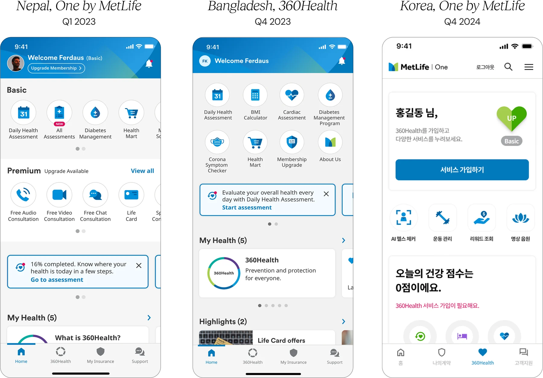
MetLife in Asia has adopted a nimble approach to each market across the region and has successfully established a diversified geographical footprint in Asia that spans across nine markets Australia, Bangladesh, China, Japan, Korea, India, Malaysia, Nepal and Vietnam.
02
How?
Local teams have faced challenges shipping products where the UI interface did not meet the necessary user experience.
03
Why?
Our mission is to ensure a unified design language across mobile app products and web portals. The Regional CX team aims to enable local teams by setting up Design System library to host components and interface.
Scaling and Unifying Asia Design System
Building a design system that drives design adoption, minimizing tech debt, and enhancing user experience across products.
My Role
Design System Lead, Product Owner
Responsible for standardization of design assets and their implementation quality
Facilitate organizational/culture change and mindset shift for design system adoption
Partner with tech lead to plan, coordinate and deploy new releases
Duration
2023 - 2024
Scope
Steered product outcome, implemented across markets in Australia, Bangladesh, Nepal, and South Korea.
Situation
The MetLife Design System emerged from a fragmented and diverse digital ecosystem, spread across local design teams and various web and mobile platforms.
UI Bugs
·Components were not ready to be reused
·Snowball effect of issues unresolved
·QA team faced repeating tasks
·Caused from insufficient handover brief to developers
Challenges
Components are fixed, inflexible
Legacy files and coded components did not meet the urgent need to cater dynamic content. The components were not built to scale for different teams.
Duplicates of Design Components
As design and product teams continue their tasks, the interface designed by local teams grew and so did the minor variants. Small increments in design foundations such as colours, spacing, and UI continue to grow in variants.
Longer Development Time
Components required high effort from development due to a lack of documentation and communication to design team. This contributed to more delay during testing as there were many repeated tasks.
Different Dev Environment for Different teams
There was no single unifying language that was used across each dev teams. (Flutter/ React JS/ Native / Web Components). Alignment was an ongoing process.
Poor Readability for Users
Several of the designs have faced feedback of not meeting legibility needs for users (font size and font colour issues). A more stringent governance on quality control was needed in design teams.
Part 2 — From Must-haves, to Good-to-Have
Design System Roadmap
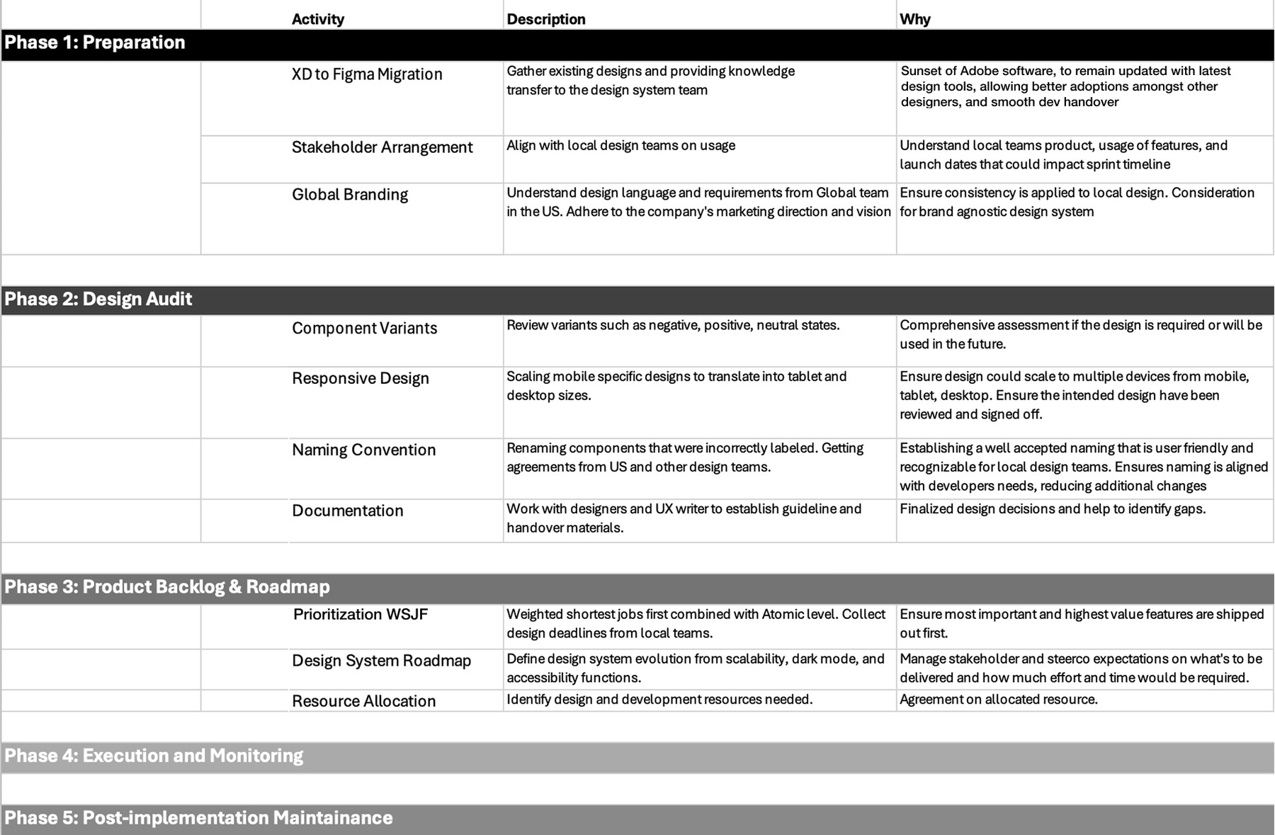
Through collaboration with co-creators, a scalable, best-in-class design system was developed, documented, and implemented, empowering every touch point. I led the MetLife UX and engineering teams through the process of building a cohesive design system across all platforms.
·Steering the product direction amongst Marketing, Developers, and CX Teams
·Auditing components from their design variants, positive/negative permutations, and interaction patterns
·Setting up documentation operations
·Identifying gaps in accessibility, establishing consensus on naming conventions
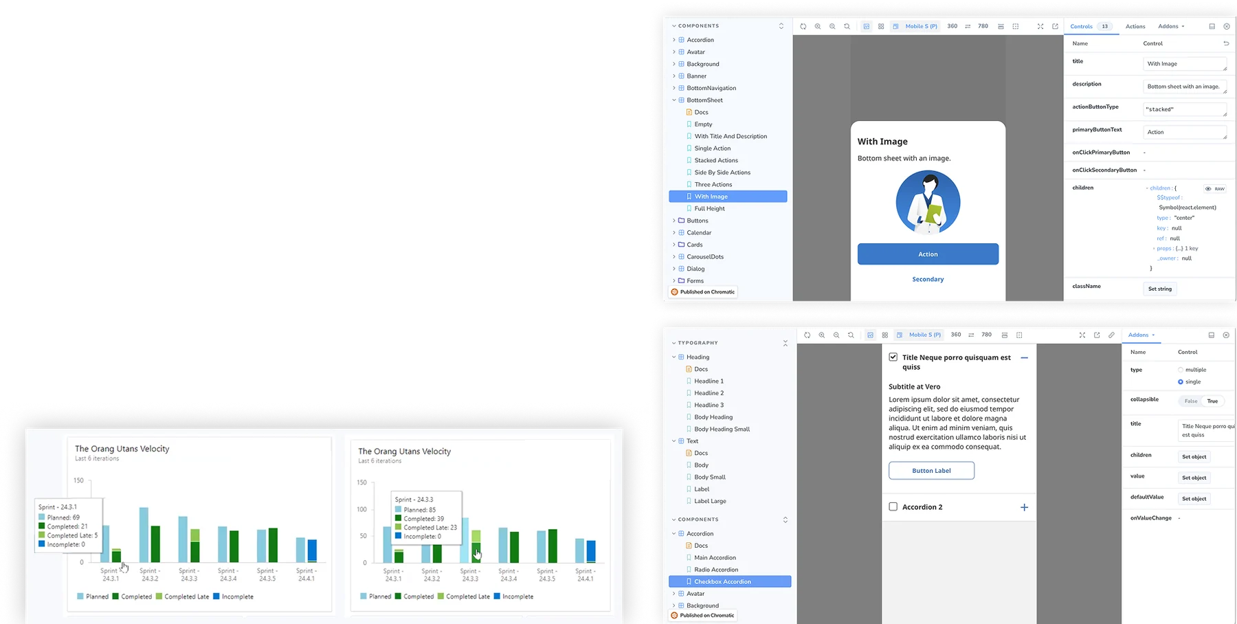
·Implementing the Figma Library to React JS and a Storybook showcase
Part 2 — How Work Moved
Workflow Optimizing
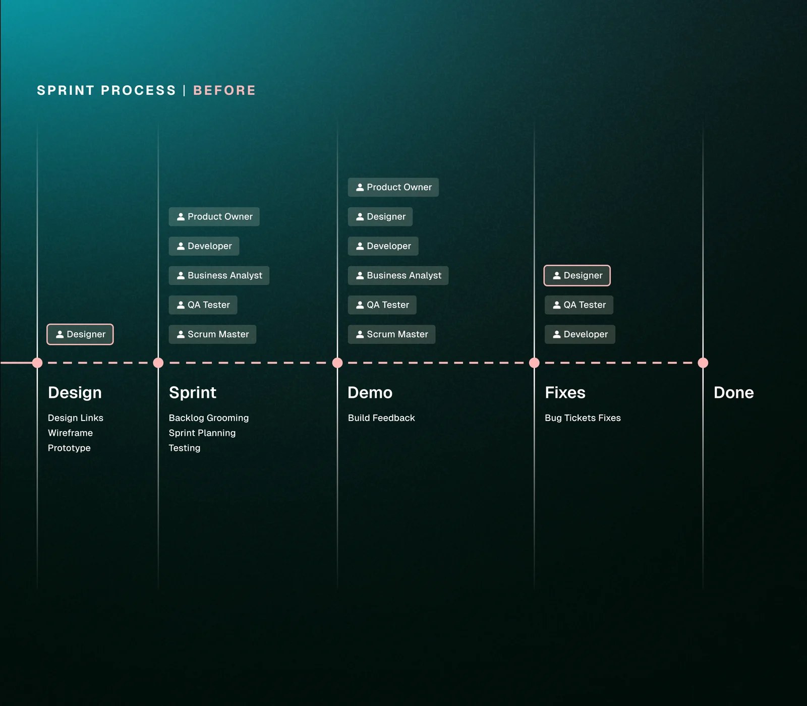
·Design team was not involved in Sprint rituals, only towards the final demo
·Handover of design assets did not cover all scenarios, design team was unaware of all the missing items
·Developers were not briefed with the accurate requirements
·Testing team faced issues tracking bugs due to its high volume and inconsistent documentation from design and Azure site.
Part 2 — How Work Transitioned
Workflow Optimizing
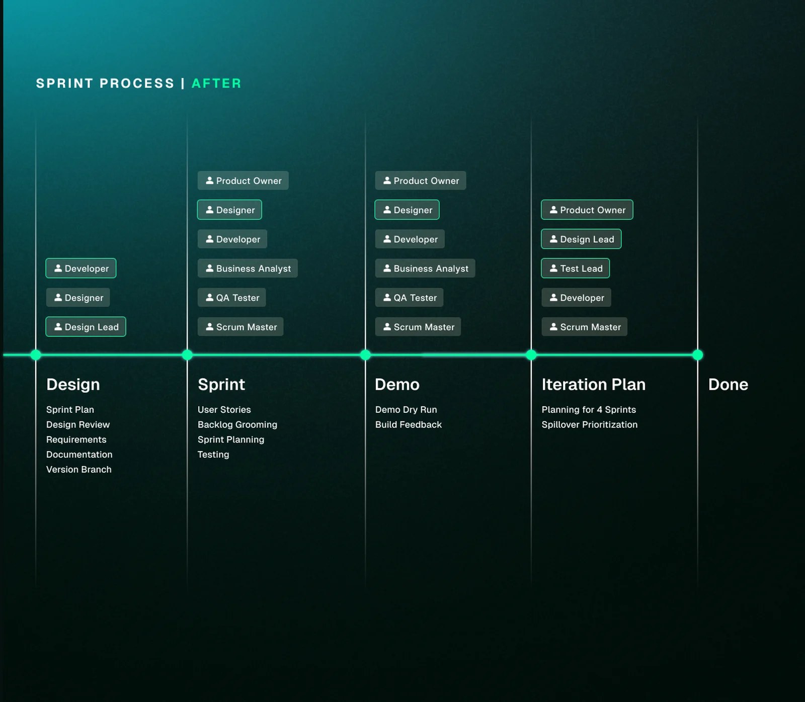
Fostering mutual understanding, and cultivating a culture of agile and lightweight collaboration.
·Collaborate with developers proactively and adjust design as we go
·Finalise design requirements with developers and local design teams to prepare UI accordingly
·Constantly push for more understanding from each side, bringing Dev and Design together
·Involve design and testing teams in the Sprint rituals that matter
·Retrospectives created a closer, more intimate setup to constructively improve each other
·Evolve from handing over a design to genuine collaboration
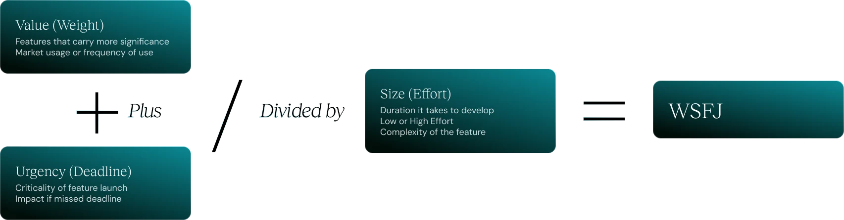
Part 3 — Prioritising Weighted Shortest Jobs First
Build What Matters Most
Part 3 — Prioritising Weighted Shortest Jobs First
Build What Matters Most
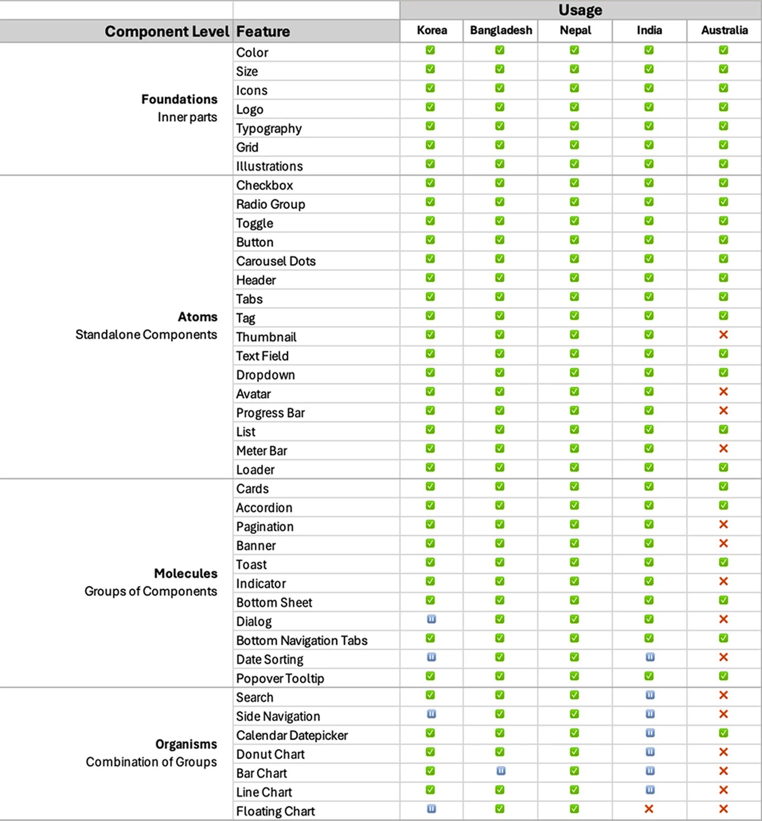
·Foundations → Atoms → Molecules → Organisms
·Putting higher-used components first, and meeting product launch dates
·Through collaboration with co-creators, a scalable, best-in-class design system was developed, documented, and implemented, empowering every touchpoint
Part 3 — Getting on the Same Page
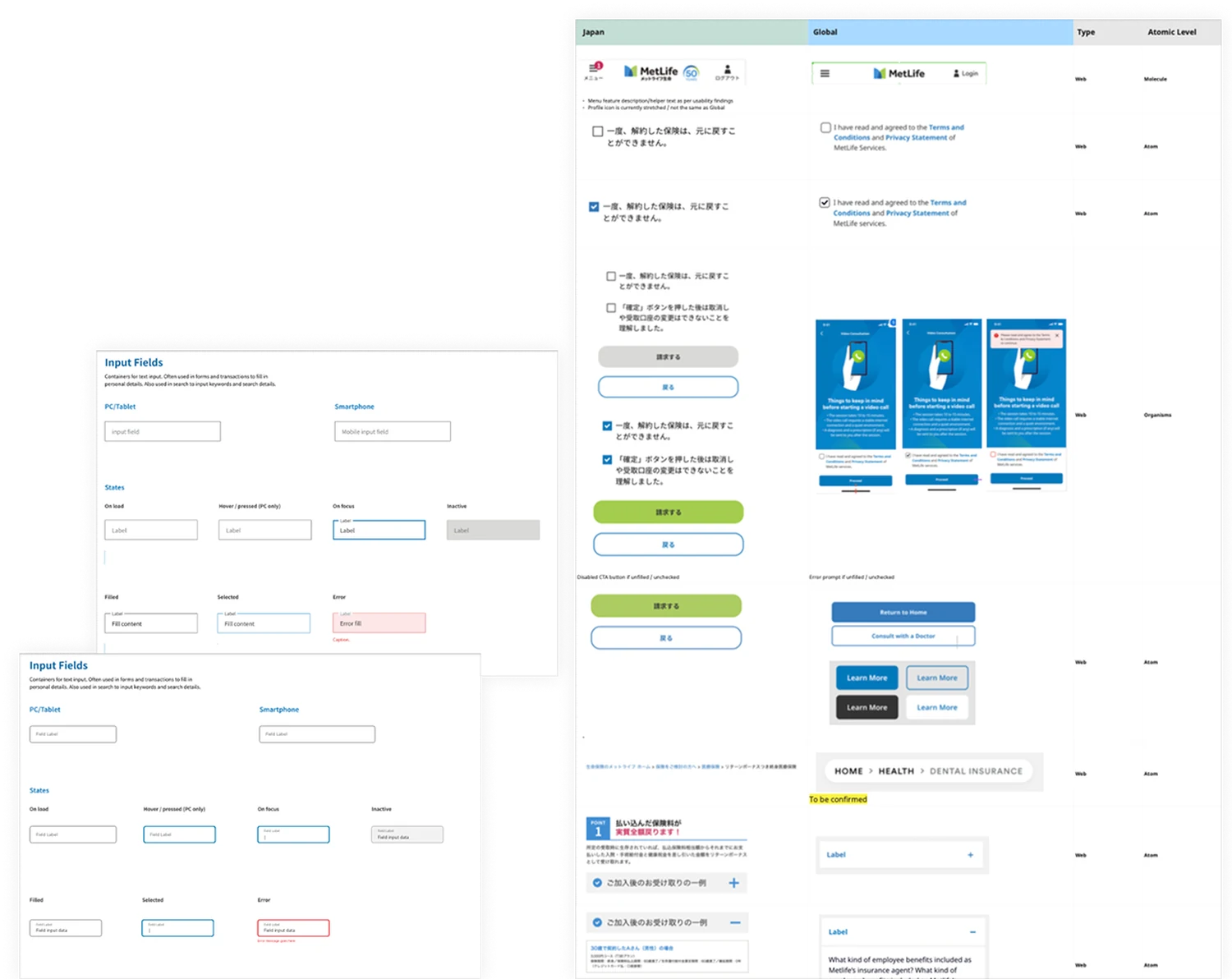
Process #1 Design Audit
·Work with local design teams to discuss existing assets
·Gain understanding of where design decisions came from, and of local context and needs
·Get on the same page about how we reduce and simplify design variants — the use of disabled buttons, text field UI styles
·Trim any excess. Less is more
Part 3 — Design System Documentation & Structure
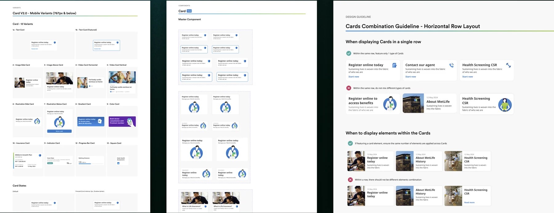
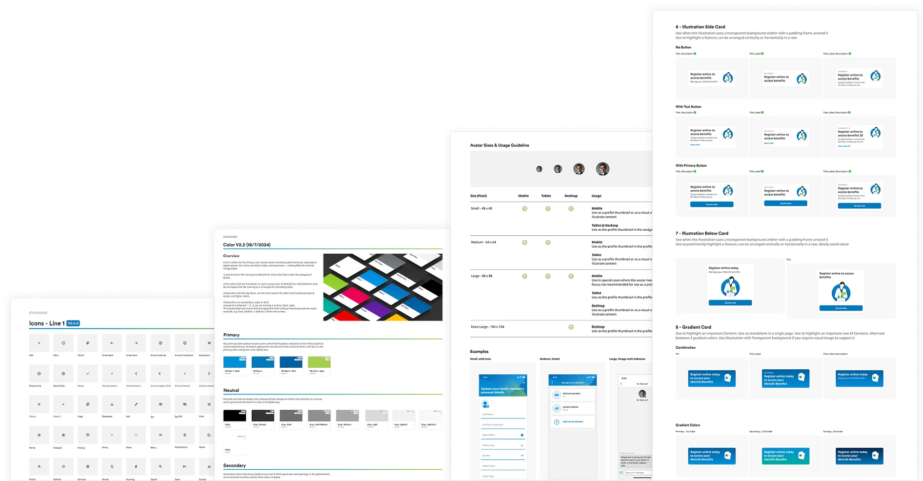
Process #2 Design System Structure
Variant Guidance — Documentation to guide designers and developers on component usage. Available as scalable mobile, tablet and desktop variants.
Master Component — Flexible, editable components that can be resized. Icons and content update according to the product’s content.
Guideline — Design guideline for best practices.
Part 3 — Design System Documentation & Structure
Process #3 Component Handover and Documentation
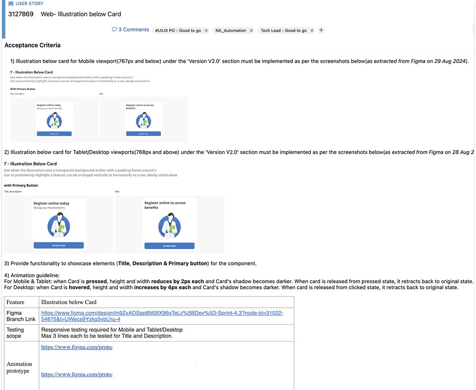
JIRA Requirements
Name & Date
Naming of the component is a crucial aspect that has been agreed upon by the team.
Variants
The different types of variants that fall under the component — primary button, icon button.
States
Disabled, Active, Focus, Hover/Pressed, Selected.
Examples
Examples of how the component is used, to give developers context.
Figma Branch Link
An important part of handing over the latest version. Design components are frozen so no further changes occur while development is ongoing.
Part 4 — Adoption by Teams
Figma Library
Improved adoption rate to 80%, across design and dev teams
Drove 80% adoption of 72 shipped components across Bangladesh and Nepal, with an estimated 30% adoption in South Korea.
Part 4 — Sprint Planning
Storybook Library
Launched 72 components
Actively used by design and engineering teams across every market on the system.
Iterating to improve team delivery
Within three sprints, the team was completing 25% more tasks per iteration.
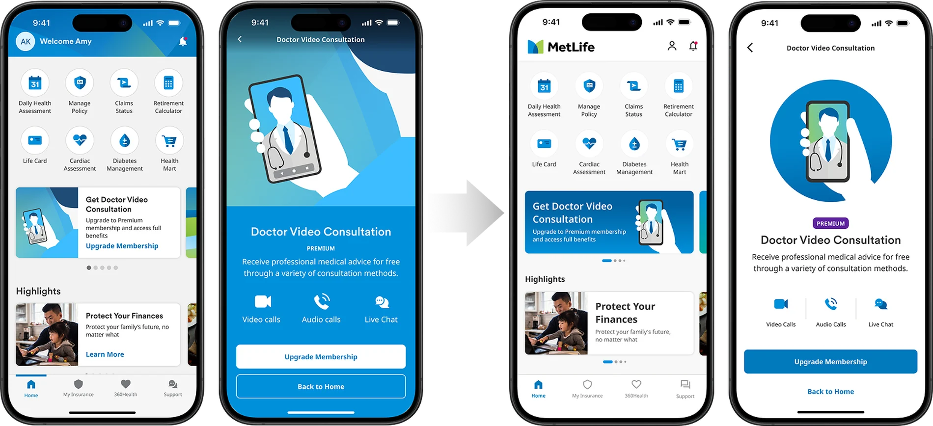
Accounting for Brand Refresh
We modernised the interface in stages, without disrupting how people already used it.
Refreshed interaction patterns · Lighter, more modern visual language · Fewer elements competing for attention.
Outcomes
What the system changed
72
Components shipped across the Figma library and Storybook, documented and handed over to engineering.
80%
Adoption across design and engineering teams in Bangladesh and Nepal, with an estimated 30% in South Korea.
+25%
More tasks completed per iteration, reached within three sprints of the handover process going live.
Evolution of the Asia Design System
What’s next
Automated Testing
Leverage the latest tools to automate manual effort, and explore design-to-code flows that reduce hand-off work.
Accessibility Expansion
Address accessibility needs beyond contrast — type scaling, touch targets and assistive behaviour.
Multi-language and hyper-localisation
Double-byte Japanese characters, and other unique or niche local formats.
A/B Testing
Experiment and iterate on existing assets to find room for improvement, and collect ideas for future components.
UX/Dev Maturity
Keep growing regional and local teams toward closer collaboration, and build a framework for the system to scale with user and business needs.